DmSelect
Updated Aug 18, 2026
DataMagik Application DesignerDmSelect
DmSelect — single choice, on the native <select>.
When not to use it. Above about twenty options, use DmCombobox — a native select with two hundred rows is unusable on a touchscreen.
States
default
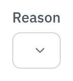

empty
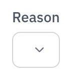

Example
<DmSelect />Props
| Name | Type | Required | Default |
|---|---|---|---|
modelValue | string | number | null | null | |
options | DmOptionsSource<string | number> | () => [] | |
label | string | undefined | |
placeholder | string | undefined | |
help | string | undefined | |
error | string | undefined | |
id | string | undefined | |
name | string | undefined | |
required | boolean | false | |
disabled | boolean | false | |
labelHidden | boolean | false |
Events
update:modelValue
Worth knowing
The dropdown is the browser’s own popup, so its background is the OS’s, not the theme’s. The option colours are set explicitly for exactly this reason — an earlier version rendered near-white text on a white popup in dark mode.